A lot of WordPress hero sections look finished and still disappear from memory within seconds.
There is a headline, a button, a background, a layout, maybe a gradient, maybe a card, maybe a stock photo of someone smiling near a laptop. Nothing is broken. Nothing is offensive. Nothing is memorable either.
That is the quiet problem with template-first design. It can help you ship a page quickly, but it can also make a brand feel interchangeable.
Start with one visual idea
A hero section becomes easier to remember when it has a single visual idea. Not ten effects. Not a pile of design tricks. One idea that supports the brand.
For a photographer, that idea might be a full-bleed image with quiet controls. For a technical product, it might be a terminal-inspired wordmark. For a creative studio, it might be a moving visual texture. For a conference, it might be a typographic system that feels like the event itself.
The point is to choose a visual language before choosing effects.
Make the headline carry the offer
A memorable hero still has to be useful. If the visitor cannot understand what the page offers, the visual style becomes decoration.
Good hero copy usually answers three questions quickly: what is this, who is it for, and why should I keep reading? The design can create attention, but the words need to aim that attention somewhere.
| Hero element | Better question to ask |
|---|---|
| Headline | Does it name the offer or the category clearly? |
| Subtitle | Does it explain the practical value without sounding inflated? |
| Visual style | Does it make the brand easier to recognize? |
| Primary action | Does it match the visitor stage? |
| Motion | Does it add atmosphere without making reading harder? |
Use motion carefully
Motion can make a hero feel alive, but it can also make it harder to read. Subtle movement works best when it supports the mood of the page instead of competing with the message.
A moving background, animated text texture, or small reveal can be enough. If every object is moving, the visitor may remember the motion and forget the offer.
Avoid the generic premium look
The modern premium look has become strangely predictable: soft gradient, rounded cards, big headline, abstract shapes, and a product screenshot floating somewhere on the right. It can look clean, but clean is not the same as distinctive.
A brand does not need to be weird to be memorable. It needs a repeatable signal. That could be a color relationship, a typographic style, an image treatment, a motion pattern, or a recurring visual device.
Where ASCII visuals can help
ASCII-style visuals work well because they carry a strong mood immediately. They can feel technical, retro, artistic, playful, experimental, or editorial depending on how they are used.
They also work across different content types. A headline can become text art. A photo can become an ASCII image. A short clip can become a moving ASCII scene. That gives a designer more than one way to build a recognizable visual system.
Where WP ASCIIfy fits
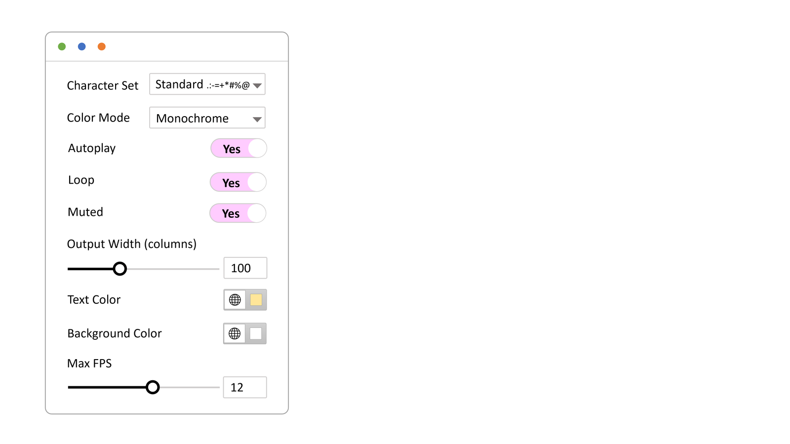
WP ASCIIfy is built for WordPress sites that want this kind of signature visual moment without rebuilding the whole site. It supports ASCII-style text, image, and motion effects, with options for Elementor and the block editor.
That makes it useful for launch pages, portfolios, personal sites, music projects, creative campaigns, developer products, and any page that needs to feel less like a default template. You can start by exploring the WP ASCIIfy demos and then decide where a visual signature would help your own site.
A hero section should leave a trace
The best hero sections are not memorable because they shout. They are memorable because the message and visual idea feel like they belong together.
If a visitor can describe the page after leaving it, the hero did more than fill the first screen. It gave the brand a shape.